Losing our identity
Just to give you a little background I used the work for the UDK(University Daily Kansan) and I also worked in the letterpress lab. I organized our vast collection of lead and wood typefaces. One of the great things about having this at a large school is the amount of donations or prospective sellers that come to you. But I think one of the best sources was actually the school that had it's own printing facilities for the UDK. There were plenty of drawers with old advertising lead and some wood type for headlines, but it was a mess in many respects. But it has to be said it is nearly impossible to keep a collection of this size completely organized with so many students coming and going. I gave it my best shot tackling one section at a time and then I cam across an A and a broken S in wood and something stuck me about them, I set them aside and continued. A week or two later I found a few more pieces and then it hit me this was the original Jayhawk typeface used for sports headlines, many of the pieces still had crimson and blue ink in the crevasses.
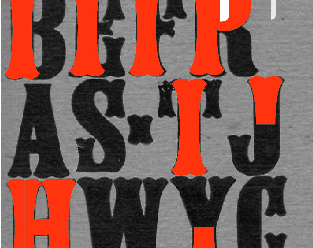
This typeface may have been used to run headline or it may just have been used in posters, but it was incomplete. I went though dozens of cases looking for more stray pieces(there are more than on the test print above) but I just couldn't find it all.
Rebirth
Recently I made my first font, Orpheum and then started on another font and another and the two new fonts aren't beyond the lower case I remembered the Jawhawk typeface back in Kansas and realized I could save it. There were many typefaces created in wood that have been lost of shall remain in wood and never make the jump to digital. But this is a typeface with some real history and although incomplete could be born again.
First thing I have to get off my chest, I am not trying to recreate a wood typeface look, I think the digitization of damaged fonts is like collecting cars because different things are broken on them and then heralding them as the way they should be. Even looking at the sample I had I recognized some errors in how they cut the letters and their relationship to one another. So today I began the painful process of cleaning it up and defining key characteristics that are shared and relevant. There are no samples of a lower case(as most headlines at the time were in all caps) and there are no numbers or punctuation beyond a hyphen.
The more I examine the typeface the more I realized this wasn't designed with the same care as most regular typefaces. It is in dire need of a more cohesive look and feel. So that's my job complete the upper case and synthesize a lower and numbers and punctuation. Here is the first hour of work, and I'll tell you this the first hours are the longest and hardest without much result but it is a snowball effect. Wish me luck.


